How to read a strategy page (the intended flow)
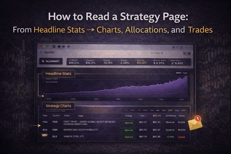
An AlgoMart strategy page is designed to be read in layers.
Each section answers a different question:
Charts – What has the journey looked like over time?
Statistics – How did that journey behave numerically?
Allocations – How did the strategy express its decisions?
Trades – What actions were taken to implement those decisions?
Reading these sections together gives a much clearer picture than looking at any single metric in isolation.

1) Charts: understanding the journey before the numbers
Equity chart (Portfolio vs Benchmark)
The main chart compares the strategy’s equity curve with its benchmark over time.
What this chart is best used for:
Seeing long-term progression, not short-term noise
Observing how the strategy behaved during major market phases
Comparing the shape of returns versus the benchmark
Things to notice:
Periods where the strategy accelerates or flattens
How it behaves during stress events (e.g. sharp market drops)
Whether performance comes steadily or in bursts
Rather than focusing on the final value, ask:
Does the strategy grow smoothly?
Does it protect capital during difficult periods?
Does it diverge meaningfully from the benchmark at key moments?
Drawdown chart
The drawdown view shows how far the strategy fell from previous highs at different points in time.
This chart helps you understand:
The depth of losses
The duration of recovery periods
How frequently deep drawdowns occur
This is often the most revealing chart on the page because it shows the emotional experience of holding the strategy, not just the end result.
Rolling returns
Rolling returns show performance over moving windows (e.g. 1-year, 3-year periods).
This answers questions like:
Were returns consistent across time?
Were there long periods of underperformance?
How variable were outcomes depending on start date?
Rolling views are especially useful for avoiding “perfect entry” bias.

2) Headline statistics: summarising behaviour, not replacing charts
The statistics section converts what you see in the charts into structured measures.
CAGR (Compound Annual Growth Rate)
CAGR answers:
If growth were spread evenly across time, what would the annual rate look like?
It’s useful for long-term comparison, but it hides:
Volatility
Drawdowns
The order in which returns occurred
Use CAGR as a summary, not a decision on its own.
Volatility & downside volatility
extracts from your stats panel
Annual volatility shows how much returns fluctuate overall
Downside volatility focuses only on negative movements
Lower volatility generally means a smoother ride, not necessarily higher returns.
These metrics help you gauge how “bumpy” the strategy has historically been.
Maximum drawdown
Maximum drawdown shows the worst historical peak-to-trough loss.
This is one of the most practical metrics on the page because it answers:
How bad did things get at their worst?
It helps you judge whether the strategy’s past stress periods are something you’d realistically be comfortable with.
Sharpe, Sortino, Treynor
These ratios put returns into context:
Sharpe: return relative to overall volatility
Sortino: return relative to downside risk only
Treynor: return relative to market risk (beta)
You don’t need to calculate them — they help compare efficiency, not absolute performance.
Alpha & Beta
Beta measures how sensitive the strategy is to its benchmark
Alpha measures historical excess return beyond the benchmark
Together, they describe how independently the strategy has behaved relative to the market it’s compared against.
Additional depth metrics
Your strategy page also includes:
Up / Down market capture – how much upside or downside the strategy captured during market moves
Tracking error – how closely it followed or diverged from the benchmark
Rolling min / max returns – the best and worst rolling outcomes historically
Correlation metrics – how closely returns moved with the benchmark
These add nuance and help explain why the equity curve looks the way it does.

3) Allocations: how decisions are expressed
The allocation tab shows how the strategy was positioned at each rebalance date.
What you see:
Assets held at that point in time
Target weights for each asset
Whether positions were opened or closed
This section shows how the model translated signals into exposure.
Key things to observe:
Concentration vs diversification
Shifts between asset classes
Changes during defensive or stressed periods
Allocations help explain what the strategy was trying to achieve, not just what happened.

4) Trades: the implementation layer
The trades tab shows the simulated trade record since the beginning of the backtest.
Each row typically includes:
Open date and price
Close date and price (if closed)
Holding duration
Return and contribution
Status (open / closed)
Trades provide transparency into:
Turnover
Holding periods
Consistency of execution
How often changes occur
This section connects the strategy’s rules to actual actions over time.
How all sections fit together
A useful way to read the page is:
Charts → understand the journey
Stats → quantify what you saw
Allocations → see how decisions were expressed
Trades → confirm how those decisions were implemented
Each layer adds clarity. None are meant to stand alone.
A practical way to use the page
When reviewing a strategy, try answering:
Do the charts and drawdowns make sense to me?
Do the statistics align with what I see visually?
Do allocations behave logically across different periods?
Do the trades reflect a disciplined, repeatable process?
If those answers line up, you’re reading the page as intended.
